All posts in Illustration

I loved your artwork so much that I ate it.

Envelope drawn by Maurice Sendak

Is there really a higher compliment one can receive than having someone eat your artwork?  I don’t think so.

I like to eat.  A lot.  I have a circle of four friends from high school in which I’m known for that particular character trait.  One of the four tried to match me once on our annual trip to small-town Pennsylvania (affectionately named “Podunkapalooza”–more on that sometime in June, when the trip actually happens) and regretted it for the rest of the night.  In fact, here’s a picture of me eating breakfast on one of those trips.

Sam eats breakfast surrounded by a wall of condiments.

Notice the wall of condiments and beverages I’ve built to keep people from eating my food.

Okay, great, you get it.  I like to eat.  What does this have to do with anything?

Today I was saddened at the news that Maurice Sendak had passed away.  Sendak’s work was a big part of my childhood, and although I know Edward Gorey gets most of the love here on my blog, Sendak was probably equally as influential in developing my love of somewhat dark illustration.  As I read his obituary in today’s New York Times, I couldn’t help but be struck by the similarities between Gorey and Sendak, from their love of solitude to their depictions of childhood as a time fraught with perils to their prickly reactions to being described as “that guy who does children’s books.”  I can’t count the number of times my mom read Chicken Soup with Rice or Pierre to me as a child.  Nor can I recall the number of times I rushed to the children’s section of the Bethlehem Public Library to see if any of the Little Bear books (illustrated by Sendak) were there so I could pore over the illustrations from the comfort of my bedroom’s purple shag carpet.

Continue Reading →

Illustrate 2012: April

Illustrate 2012: April

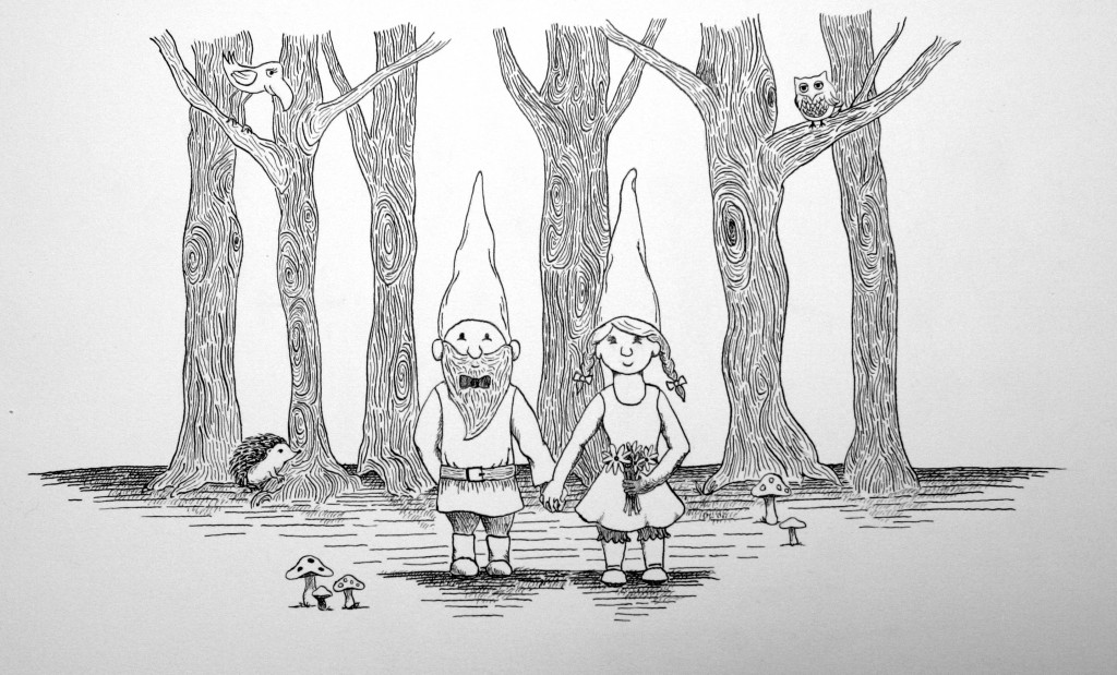
I wasn’t sure what I was going to do for this month’s installment of Illustrate 2012, but then I started working on an illustration for wedding invitations for a friend of mine who’s getting married this summer.  She and her fiancé are into gnomes, so it only seemed fitting to incorporate them into the invitations.  They’re also getting married in their backyard, which is surrounded by woods, so the trees also seemed appropriate.  The hedgehog, however, is purely my doing.

Illustrate 2012: April

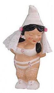
It turns out, however, that they’ve decided to forgo the gnomes on the invitations for fear of receiving an abundance of gnomes as wedding gifts.  They’re all for gnomes, but really, how many gnome-themed tchotchkes does one couple need?  Plus, there are some pretty tacky wedding-themed gnome gifts out there.  To wit, check out this little beauty:

Tacky Gnome

And now you understand why their fear is a very real one.

Continue Reading →

Illustrate 2012: March

Illustrate 2012: March

I’ve been doing a whole lot of illustration this month, as I’ve been working on wedding invitations for some friends of mine.  They’re all done, but so as not to steal their thunder, you’ll have to wait to see that illustration until after the invitations have been sent to the guests, and I post the finished product in the portfolio section of this site.  So while I was feeling a bit like that illustration should count for March, it’s probably good for me that I was forced to create something new for this project.

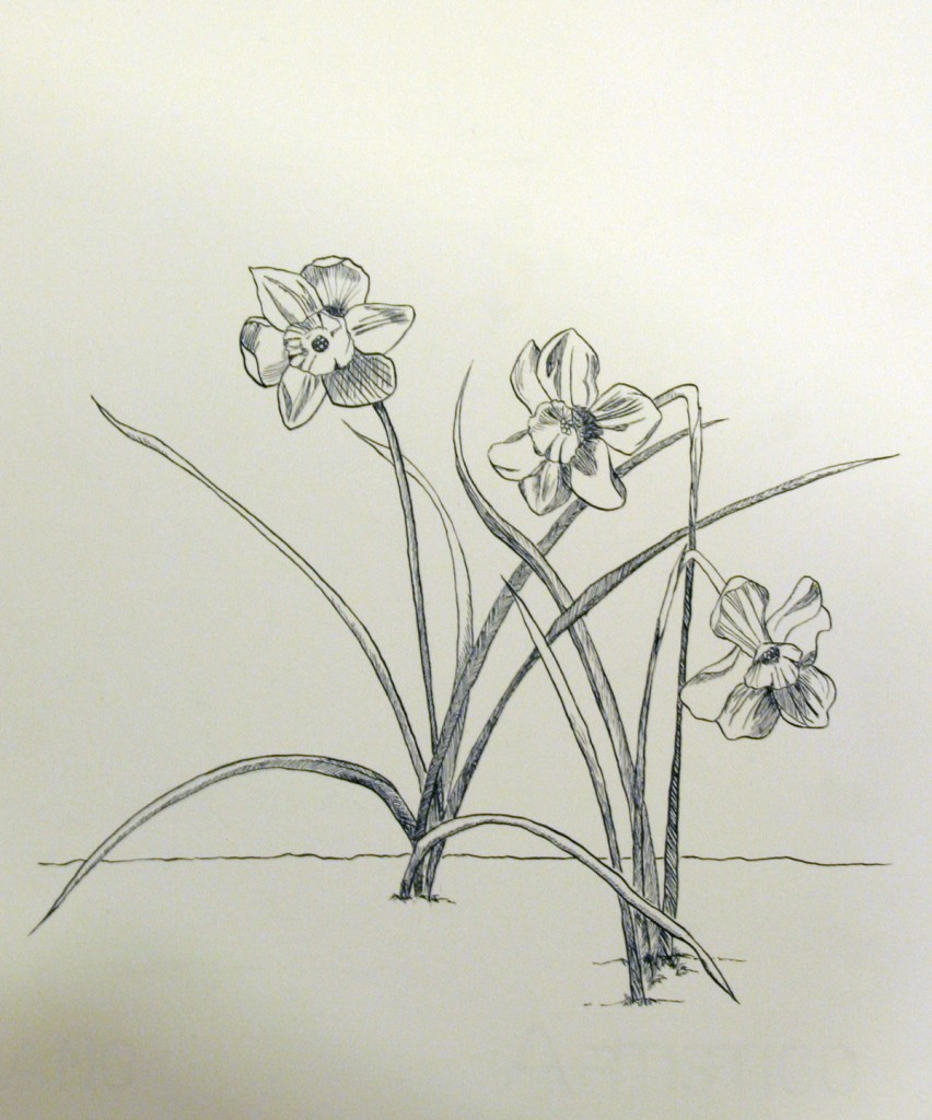
Spring has sprung a little earlier than usual here in Philadelphia, and as a result, I currently have the most painfully beautiful daffodils growing in my backyard.  The kind I have are not the sturdy trumpet daffodils you often see in public landscaping.  The ones in my backyard are dainty and delicate, and the corona is a bright orange, while the petals are a perky yellow color.  I’ve always loved daffodils because they’re one of the first signals that Mother Nature is awakening from her wintry slumber and bringing new life.

I’ve also been increasingly inspired by traditional botanical illustration because of its intricacy.  Some of the illustrations just blow my mind in terms of detail.

So it only seemed fitting that this month’s illustration subject should be the daffodils in my backyard.  Coincidentally, I also happened to relocate my fine-tipped pen nib, so I was able to reflect their delicacy in my line.  It all worked out quite nicely, as you can see below.

Illustrate 2012: March

Follow

Get every new post delivered to your Inbox

Join other followers: