Early on in my design career, before I was feeling as confident in my abilities as I do today, I used to worry that I was charging too much for the work I was doing. I suspect that there are many designers (or artists or musicians or writers) in their early careers that feel this way. I think we tend to undervalue the things that we really enjoy doing, and we do ourselves a disservice by compromising the true value of our work in exchange for the privilege of being able to continue to do that very work. As a musician, I’ve been very fortunate to have a parent who is also a professional musician, so I never had this problem when it came to setting prices for performing because once I started performing for pay, she instilled in me the importance of being fairly compensated for my time and talent. But since I came to design from a fairly circuitous route, I found it difficult to do the same thing, largely because that little defeatist voice in my head told me that I didn’t have the appropriate credentials to be fairly compensated. I suspect this isn’t uncommon.
When it came to logo design work, it didn’t help matters that there were an abundance of websites offering to provide clients with an original logo for $99. How was I supposed to compete with that?
Luckily, I also found the HOW Design forum early on in my career. It was filled with lots of professional designers talking about all sorts of topics ranging from specific design program advice to how to run a design studio to what to charge. What I quickly learned was that, in fact, I wasn’t supposed to compete with those $99 logo websites. I learned that those sites do little more than to devalue the field of design, similar to clients who ask you to create work on spec, or to “improve your portfolio.” And usually, the work from those sites falls into the you-get-what-you-pay-for category–bland designs that look like they were made by a design robot. Which, in a manner of speaking, they were.
I don’t take on a huge amount of logo work, but over the past couple of months, I’ve been working on a logo project that has been really fun, and it’s embodied my process for creating a logo. I thought I would share that process with you because (1) I think it’s interesting and (2) it demonstrates why logo work–or at least good, thoughtful logo work–should cost more than $99.
This particular client found me by Googling “handmade logo,” or something similar, which was exciting because I didn’t know that was a search term my website showed up for. She said she liked the illustration work, especially on my wedding invitations, and she wanted a logo that had a hand-drawn, whimsical quality to it. The logo is for an online company called twist (launching in a month or so!) that will sell home organization products that are functional and stylish. Really, the best way I can describe the products is if you took a braided rug made out of hip, bright fabrics and formed it into three-dimensional objects like baskets, bowls and totes. Except the fabric isn’t braided, it’s wrapped around thick cording (so it’s rigid) and then zig-zag stitched to itself in a contrasting thread/yarn. They’re very cool and unique, and the client kindly sent me some samples to work from.
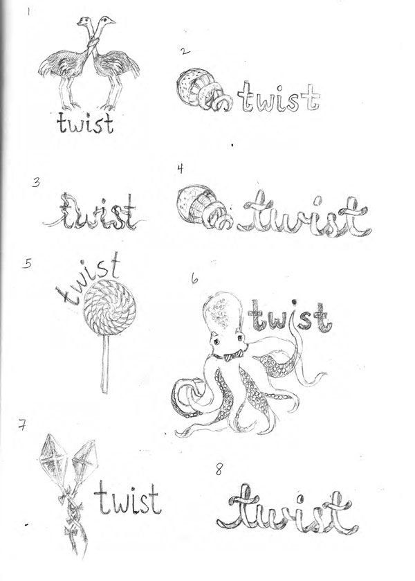
I started the design process as I usually do–with drawing. I try to shut off the judgmental filter in my brain and draw as many concepts as possible. Since the client had said that she liked the animals on my wedding invitations, I tried to think of animals that could “twist.” Then I branched out and thought of other things that twisted. I made a big list and started drawing. Not everything on the list became a drawing, but a bunch of stuff did. And some of the drawings are crap, but that’s okay, because it’s just a rough pass. No censorship. Anything is possible in this phase. Here’s the result of the first brainstorming session.
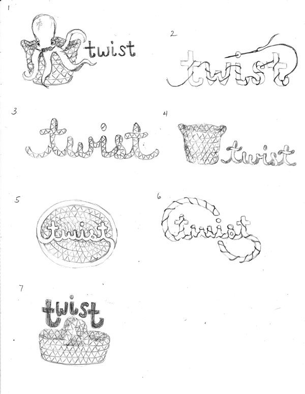
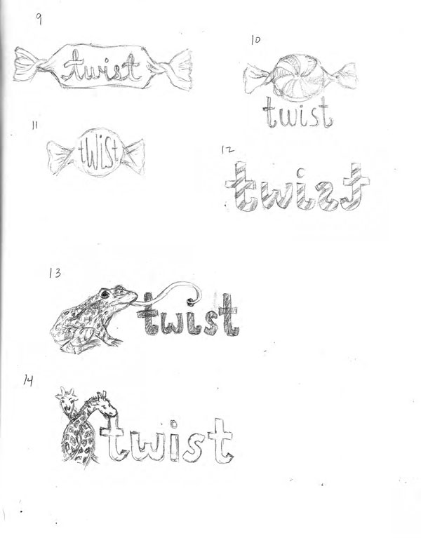 After further conversation with the client, it turned out that the octopus was a big favorite, as was the simple type treatment in #8, as well as the viney #3. We had a discussion about the pros and cons of using a “mascot” like the octopus because it didn’t really have anything to do with the product–it was just whimsical. The client asked me to explore creating something that was a little more representational of the actual product. But she didn’t want to abandon the octopus just yet. The second round of drawing yielded the following:
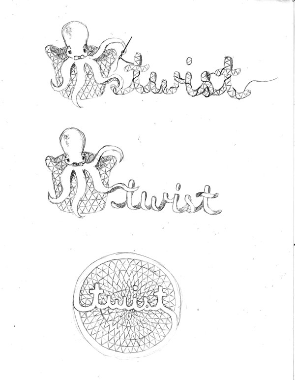
The needle and thread of #2 really resonated, as did the actual representation of the cording with the zig-zag stitch in #3. And there was still that fantastic octopus. The client decided that she’d like to see the octopus with the cording of #3 as the name and the needle and thread worked in. She also liked #5 as it was. I had the sense that the logo would become cluttered if it were a combination of #1, 2 and 3, but that’s one of the things about being a designer–it’s a balancing act between doing what you think is best and pleasing the client.
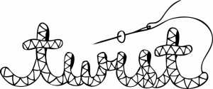
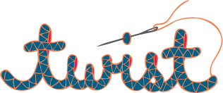
In the end, the client agreed that the combination was too complex for a logo, so the last iteration was the final design–the word, twist, hand-drawn to look like the cording of the actual products with a needle and thread extending from the cording.
After the basic design was selected, it was time to tackle color. Color can be a tricky beast, and it turned out to be that way for this client. Some clients I work with are very clear on color, some have very little opinion, and others don’t know exactly what they want, but they know what they don’t want. In the third case, it’s my job to help shepherd them through the decision-making process, and that was the case here. We went through four iterations of color, each with about six individual options, before the client settled on one. I generally hold back my opinion so as not to cloud the client’s gut instinct, but if I feel like a client is struggling, I’ll suggest what I think might be best. In this case, I made some suggestions.
Four iterations may seem like a lot, but color is tough, especially when you know that you have to live with the logo for a very long time. Get it right, and it can draw people in and communicate your brand perfectly. Get it wrong, and you risk turning people off or looking dated.
And this is what makes logo design work difficult and worth paying for. A good designer will ask meaningful questions about your brand, listen to the answers, internalize what you’ve said and try to visually represent the verbal description. All of this work takes many hours, and it requires patience, creativity and thoughtfulness–all of the things that make it cost more than $99.
So I guess you’re wondering what the final result of all this work was. Well, here you go.
I have to admit that I’m a little sad that the octopus didn’t make the final cut, but it sounds like he will be making an appearance on the forthcoming twist website. Keep your eyes peeled for him!


Leave a Comment
Let us know your thoughts on this post but remember to place nicely folks!