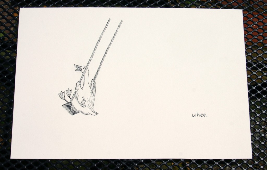
Sometimes I get these very short and slightly ridiculous e-mails from my sister. It’s okay because I send them to her, too. The one I received yesterday was titled Logo idea for funnovate and simply read, “Goose on a swing. That is all.” Cryptic? Maybe. Inspirational? Definitely.
As the end of the month was quickly approaching and I’ve been very busy working on a new service offering (to be revealed soon!) for my sustainability consulting firm, iSpring, I was feeling the pressure of what to draw for this month’s illustration. Since last month’s illustration was a little more elaborate, I had decided that this month’s would be simple–also convenient because time was scarce. However, I wasn’t feeling very inspired. Then four little words meandered through my inbox–Goose. On. A. Swing. You never know where inspiration will come from!
So with that, I give you this month’s illustration.
Now, I am exceedingly prone to judging everything I create immediately after I finish it (if not before), so of course I started thinking that perhaps this month’s illustration was a cop-out because it didn’t take as much time as some other months. Thankfully, TubaDan recently posted (on his shiny new blog) about creating without judgment. I remembered the post and reminded myself that the point of this project was not to create a masterpiece each month but to force myself through the creative exercise of illustration, regardless of the outcome. Thanks, Dan! I feel much better now.
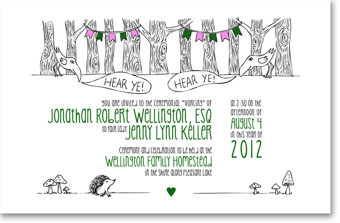
Besides this project, I’ve actually been doing quite a lot of illustration over the past couple of months, with most of it being centered around weddings. If you’re following along with Illustrate 2012, you’ll remember that last month’s illustration was going to be for a friend’s wedding invitation, but then they decided to forgo the gnomes for fear of receiving tacky gnome wedding gifts. Well, here’s the gnome-less illustration that ended up as the invitation.
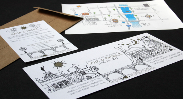
And then there’s the other illustration I did for a Philly-based wedding. I’m pretty psyched about this one, as I think the skyline worked out pretty well. You can read all the details about this project over on its portfolio page.
So I guess maybe I’ll cut myself some slack on the simplicity of this month’s illustration. Whee!


Leave a Comment
Let us know your thoughts on this post but remember to place nicely folks!